When I first saw the title for Tuesday’s session, “The Future Is Friction for Memorable Experiences,” I thought it would have something to do with physics. But, of course, the talk was about marketing psychology and customer experience.
Friction is the idea that certain tasks might be more difficult (even if only slightly) than they could be, slowing users down a little in the process. These tasks, even though they can be counter-intuitive, actually help the user experience in a variety of different ways. Some include delays in response on websites to make the user feel like work is being done. Others involve giving the user more choices so they feel increased ownership over a product.
For example, people who purchase Ikea furniture get a sense of satisfaction from building it (figuring out the diagrams is definitely a type of friction) and perceive the brand as being more valuable than other low-cost, preassembled furniture.
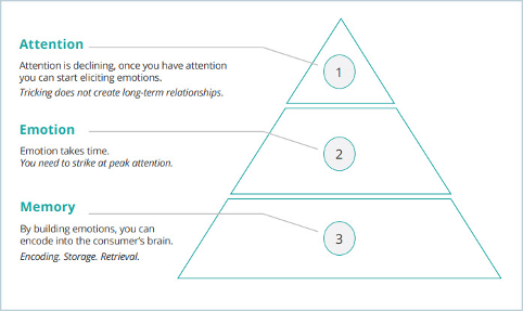
In the digital world, we distrust anything that is too easy or instantaneous. This is called the “labor illusion,” and it shows that events are more memorable if they are slightly more complicated or delayed (as long as the delay feels like it is due to the system doing some kind of processing to get the “right” results). However, we only have 3 seconds to make an impact in the digital domain, so the idea is to quickly grab attention then create emotion (hopefully positive, like interest or excitement), which helps build memories. (See the illustration, below.)
Three stages for building memory using digital friction as part of the customer experience.
Building interactions into the experience help with this. Customization options, like the one Nike uses to engage site visitors by allowing them to design their own trainers, slows customers down, makes them think, and creates a more memorable shopping experience.
Before watching this event, I had mostly assumed that widgets and style choices like these were based on aesthetic appeal, so I was very interested to learn that these choices actually hold a lot more meaning. It will definitely change how I look at websites like Amazon and Walmart from now on, as well as the ones I help our customers build.
KEY TAKEAWAYS:
- Many of the most popular web components are based on complex user psychology.
- People don’t necessarily want the easiest option, partly because ease discourages exploration and discovery.
- Friction in a website can increase how much users remember it because it creates a more satisfying experience.
HOW ALPHA SOLUTIONS CAN HELP
Alpha Solutions has experienced web developers, as well as CX and UX strategists, who know how to optimally utilize market psychology in the development of their websites. Our clients don’t just hire Alpha Solutions to build websites. They hire us to build websites that bring in customers and improve their businesses. This presentation highlighted a very necessary part of that skillset.
Learn more about our Interactive Services.
Peter Wright is a Developer for Alpha Solutions who focuses on programming Sitecore web applications using efficient and critical web development techniques.

NIKET ASHESH
Partner


